- 17.09.2024.
- News, Marketing, Web design
Your company's logo has the power of first impressions, and that’s why logo matters. Let's face it - in the world of yacht charters, looks matter. Your logo is often the first thing potential clients see, and it can (sometimes) influence their decision to explore your services further. Do you think they will want to explore or move on to the next one?
The role of a company logo is to convey your unique value proposition, preferably immediately from the start.
What does your logo really say about you?
That your yacht charter is all about luxury experiences? Or perhaps you specialize in adventures? Or bareboat vessels? Your logo should say (or shout) these qualities to your audience.
A well-designed, memorable logo is what differentiates you from the yacht charter crowds, where everything seems the same.
The yacht charter market is competitive, and Croatian even more so.
In the end, your entire brand, together with the logo, isn't just competing against other yacht charters.
It's vying for attention among all the visual noise of other tourist accommodations, attractions, restaurants, and activities...
Logo and color psychology
Colours are powerful communicators of mood and intent.
When designing your yacht charter logo, think beyond "blue, because... sea."
Colours have a big influence on human psychology, and they can also elevate your whole brand.
Let’s use bareboat yacht charter experience as an example; self-reliance and adventure - two pillars of the bareboat yacht charter experience.
How do we translate these concepts into a colour palette?
Rich, deep turquoise can evoke feelings of trust and professionalism, while gold or silver accents add a touch of luxury. For adventure, we can incorporate accents such as coral.
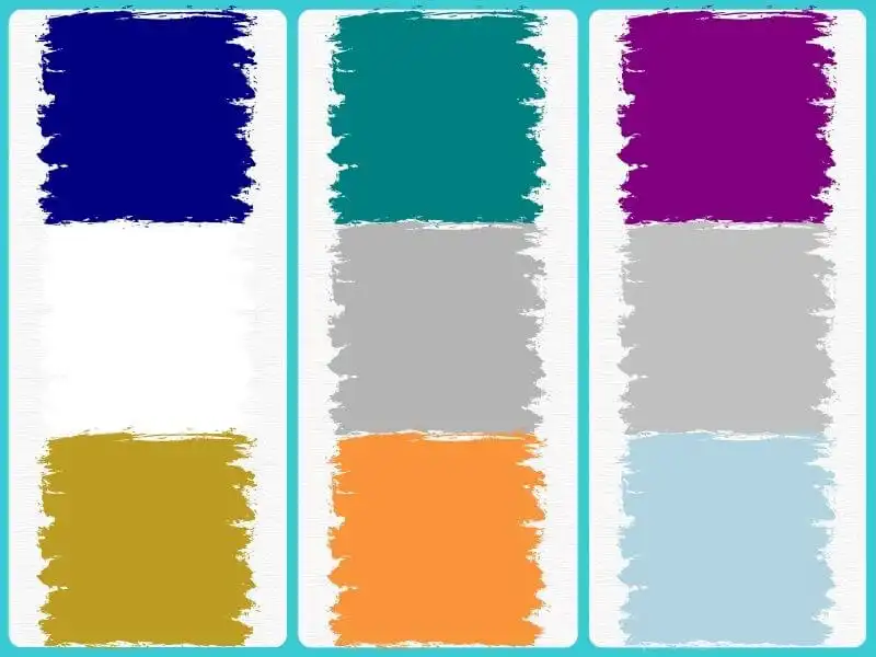
But don't stop at the obvious choices. Consider these colour combinations and their potential impact:
- Navy blue + crisp white + gold = Classic luxury with a nautical twist
- Teal + warm grey + orange = Modern, adventurous feel
- Deep purple + silver + pale blue = Unique, high-end aesthetic
Remember, contrast is your friend. A well-balanced colour scheme ensures your logo is legible across various applications - from boat wraps to website footers.
Our tip: Test your colour choices in different lighting conditions. Colours that look great on your computer screen might not have the same impact under the bright Croatian sun.
Typography - The right font makes all the difference
Fonts can convey elegance or shout excitement, all without saying a word.
For yacht charter businesses, striking the right balance between professionalism and approachability is crucial.
When choosing fonts for your logo, consider the personality you want to project. Serif fonts often convey tradition and reliability.
Sans-serif fonts, on the other hand, can feel more modern and cleaner. But don't feel limited to just one. Pairing fonts can create a dynamic, layered look.
Some font combinations to consider:
- Sans-serif bold for your business name + light serif for the tagline
- Elegant script font for the main text + sans-serif for the rest
- Capitalized sans-serif + a complementary lowercase font for additional text
Remember, legibility is also crucial. The swirly script might look great up close, but will it be readable on a yacht hull or from a distance? Always test your font choices at various sizes and distances.
Many fonts have multiple weights (light, regular, bold, etc.). Using different weights of the same font family can create contrast without introducing a new typeface, keeping your design cohesive.
You can always customize your font by tweaking existing font or creating custom letterforms to give your logo a touch of uniqueness. Just be sure to stay consistent with your overall brand identity.
Don't miss downloading our webinar "Stand out or step aside: The power of branding in a saturated market" (which is held in Croatian).

Yacht charter logos and symbolism
When designing a logo for your yacht charter, it’s best to stay away from the obvious – anchors and yacht/sailboats.
Yes, anchors are THE symbol of nautical. But in the yacht charter business, they're also... well, a bit cliché and passé.
How can you incorporate maritime elements without resorting to the same old symbols?
Think about the essence of the yacht charter experience. It's not just about the vessels - it's about freedom, exploration, and luxury.
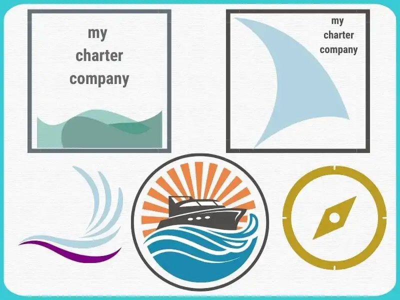
Here are some alternative symbols to consider:
- Stylized waves: Represent the sea without being too literal
- Compass rose: Hints at adventure and navigation
- Billowing sail: Captures the feeling of wind and movement
- Seabird silhouette: Evokes freedom and coastal beauty
- Abstract yacht shape: Modern take on the classic boat symbol
But symbolism doesn't have to be purely visual - the arrangement of your logo elements can convey meaning. An upward-slanting text suggests optimism and progress. Circular designs can represent unity or the cycle of memorable experiences you offer.
Don't be afraid to get abstract.
Sometimes, the most powerful symbols are those that aren't immediately obvious, so choose a simple, elegant shape representing your brand.
The way to go? Not cramming every aspect of your business into one tiny logo.
Choose one or two key concepts and represent them well.
Our advice: Don't confuse simplicity with generic. Your logo should still be unique and reflect your brand personality.
Put your logo everywhere - from business cards to yachts
Why do you have your logo if not to be used? So, make sure to use it everywhere you can. After all, it’s its mission – to be recognizable.
Put it on all marketing materials, from digital to traditional – from business cards to sails to social networks and website.
The logo must look sharp in every situation.
Vector format allows for scalability without loss of quality. But don't just rely on software - physically test your design at various sizes.
You can also do multiple logo variations for different contexts:
- Full version: All elements, including business name and any taglines
- Simplified version: Main visual element and business name
- Icon version: Just the primary visual symbol for very small applications
Your logo has to be and look its best embroidered on staff uniforms and printed on brochures, as well as on social media profile pictures or across the side of a yacht.
So keep in mind this also - a complex logo might look great on a billboard but becomes a muddled mess when shrunk down for a favicon.
What is a favicon? It's that tiny image that stands as a website image in web browsers.
Our tip: Create slightly different versions of your logo that adapt to various sizes and contexts. For example, your full logo might include your business name and a symbol, but the smallest version might just use an initial or simplified symbol.

DIY vs. professional design - make the right choice
The age-old question: should you design your logo yourself or hire a professional?
Let's break down the pros and cons:
DIY approach - pros
- Cost-effective (initially)
- Complete control over the process
- Intimate knowledge of your brand
Cons
- Potential lack of design expertise
- Time-consuming
- May result in an amateurish look
Professional design - pros
- Expert knowledge of design principles
- A fresh, outside perspective
- Time-saving for you
- Potentially stronger, more polished result
Cons
- Higher upfront cost
- Requires clear communication of your vision
If you decide to go the DIY route:
- Invest time in learning basic design principles
- Use professional tools (e.g., Adobe Illustrator, not MS Paint)
- Get honest feedback from others (in the industry, your employees or such)
If you choose to hire a professional:
- Look for designers with experience
- Provide a clear brief, including your brand values and target audience
- Be open to their ideas, but don't be afraid to provide feedback
Remember, your logo is an investment in your brand - give it the time and resources it deserves.
A well-designed logo should serve your business for years, making it worth the effort to get it right.
If you need help or a professional who will do your yacht charter justice that your company logo deserves, contact us.
Don't forget to download up for our webinar (which is held in Croatian), where you will learn more about graphic design and why it is important (and especially the logo).

Categories of trends
- News
- Sale
- Marketing
- SEO
- Web design
- Social media
- Technology
- Regulations
- Management
- Education
- Finances
- User experience
- Graphic design
Newsletter
Sign up for the newsletter and receive the latest trends and tips straight to your inbox