- 23.12.2025.
- News, Marketing, Graphic design
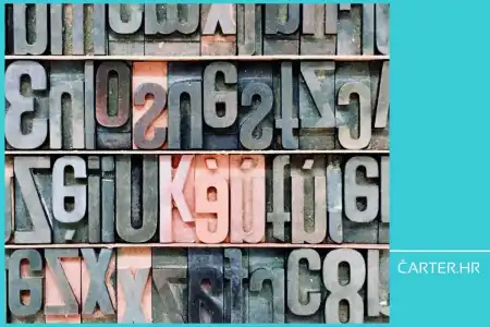
Some visuals immediately make sense, while others leave the impression that something is off. The difference rarely lies in personal impression or technical execution, but most often in the basics that are frequently overlooked. In this text, Barbara Zec explains how understanding the basic principles and elements of design influences the way we build brands and make decisions.
Every brand, including a yacht charter brand, is built through consistency over time. A designer can guide you and accompany you on that path, but you can also create your brand materials in-house if you have well-defined brand foundations and some basic knowledge. By this, I do not mean knowledge of graphic software, which is usually the first thing that comes to mind when talking about graphic design or visual communication design. And that is great news, especially if you are not inclined to spending hours sitting in front of a computer. Let others do that for you. When I say “basic knowledge” and write about design and branding, I mean basic principles and basic elements of design.
Why the basics matter
It is always good to remind ourselves why knowing the basics is important. It does not matter whether we are talking about design, handling a boat, or cooking. I like to use the example of cooking because I am, like most people, a “cooking amateur”, so I believe you will recognize yourself in this example as well, whether you like cooking or not. You certainly consume food.
Before we dive into the topic, I will first answer the question of why you should even care. Because learning the basics sounds quite boring. For example, anyone who learned to play an instrument in childhood surely still remembers endless scales and the first notes they had to master. They are etched into your brain, right? Precisely because today, “even if someone wakes you up at 2 a.m.”, you know exactly where each note is, you can play almost any song.
When it comes to cooking, to return to food after this short music lesson, there are two approaches. We can cook by following a recipe or by experience. The limitation of cooking by recipe is that you perform steps without knowing “why something is done the way it is done”. Which means that if you have to improvise, you are in trouble. If you know the basics, how each ingredient is prepared, how it pairs with other ingredients, what a particular spice does, what happens when you use high heat and what happens when you use low heat, you will always manage. And that is one of the reasons why the basics are important. When you know “why” you are doing something and not just “how”, you understand the logic behind all the steps you have taken.
And you have a solid foundation for further development. Knowledge grows by building on what we already know. Since I am feeling a bit academic today, think for example of mathematics. First we learned to count to 10. Then to 100. When we are small, one hundred seems like “the biggest thing ever”. Then we learned to add up to ten. Then subtract. Then multiplication, division, and all the way to fractions, functions, and however far one managed to get. Today, with access to the internet and AI, anyone can ask a mathematical or any other question and get an answer. However, if you do not know the basics, if you do not know how something was “calculated”, how can you check whether the answer is correct? If you know the fundamentals, every, even the most complex calculation, can be broken down into basic parts.
Knowing the basics also makes you resilient to change. You can adapt very easily if the need arises. And not only that, perhaps the most important thing you gain from solid foundations and knowledge of the basics is confidence in yourself and in your decisions. Basic principles and basic elements of design teach you to make informed decisions. Creativity and design are not “magic”, but like everything else, they have rules.

What are the basics of visual communication design
In the previous article, I mentioned that a designer’s job is to establish visual concepts, that is, to translate verbal ideas into a visual language. If you are reading this, I assume you already have some experience with design and designers and that you have had the need to put an idea into practice. And you did this with the ultimate goal of bringing your brand closer to your customers.
Perhaps you needed a simple flyer to present your yacht charter. It included an image, a headline, a short offer description, and contact details showing where and how to find you. Perhaps you even started designing the flyer yourself in some software. And you could not understand why you were unable to achieve what you wanted. Or you managed to create something, but the flyer failed to attract the attention of potential clients and regularly ended up in the trash, or even worse, on the floor. The reason is most often not a lack of knowledge of the software. The reason most often lies in a lack of understanding of the basics. Because it is necessary to know how to arrange all these elements on a format in a way that will attract the viewer’s eye and then lead to action and reaction. Without knowledge of the basic principles and basic elements of design, there is no good and functional design.
These principles and elements serve visual composition, that is, they help us consciously choose every element, color, or shape, because they, no matter how small or seemingly insignificant, have their own meaning based on biology and psychology. In other words, the person who observes and reads a design instinctively feels what is expected of them. If you know how to manage this, you can be confident that your brand materials will work for you exactly as you expect them to.
Basic principles of design
Finally, we are getting to the point. In this article, I will try to go through all the basic principles and elements of design as briefly as possible. To set foundations that will be sufficient for you to start noticing and using them. We begin with the principles.
I mentioned a flyer earlier, but these principles can be applied to any material, whether printed or on a screen. Literally, from the smallest sticker, through a business card and a flyer, to a brochure and a website. Because every design is actually made up of elements (more on those later) that are arranged in a certain relationship on a given format.
Basic principles of design ensure that all these elements work together visually and functionally. In other words, when a design follows the basic principles of design, you instinctively know that it “works”. When it does not follow the basic principles of design, we usually hear things like “something bothers me, but I don’t know what”, “it feels kind of odd”, “can you make the logo bigger”, and similar comments. By the end of this article, you will know exactly why some designs work for you and others do not, and you will know how to communicate that to your designer.
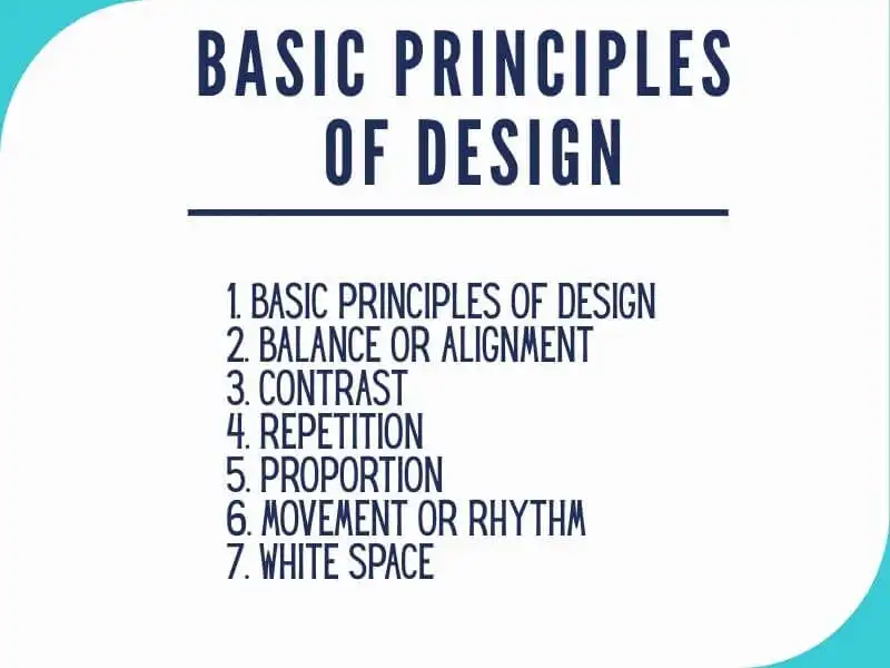
The basic principles of design are emphasis or emphasis, balance, contrast, repetition, proportion, movement, and white space. On the internet, you can find lists with many more or fewer principles, but I believe that these seven cover everything we need in order to recognize good and functional poster, logo, or brochure design.
1. Emphasis or highlighting
A common approach mistake that I have often heard from clients is “Everything is important”. For example, we are designing a flyer for a yacht charter that I mentioned earlier, the client sends a full page of text in Word, and when I ask what is most important, the answer is “everything”. Someone less experienced and with a “I don’t want to upset anyone” mindset would then design the flyer so that everything is big, if it fits, and then they would not be able to see the forest for the trees. The headline, offer text, call to action, and contact information all the same size and color. Because everything is important. And then it becomes enlarge, recolor, and generally limitless tinkering, while the flyer gets worse and worse.
Not everything can be important. There must be a hierarchy. Answer the question “What is the most important piece of information I want to convey?” or “What do I want the viewer to read first?”. For example, the most important thing can be emphasized by size, being the largest, and by position, for example at the top or in the center of the format.
2. Balance or alignment
Every element we place on a format (image, text, logo) has a certain perceived weight. This can come from size, but also from color and texture. Imagine these elements as pieces of furniture in a room. You certainly would not push everything into one corner and pile it up, but would instead place individual pieces so that they are balanced, functional, and have enough space around them.
We can achieve balance by arranging compositions symmetrically, asymmetrically, or optically. Composition is a term that actually describes the relationship between elements in a space or on a format.
For example, when laying out pages in a sales brochure, this might mean placing one large image at the top center and three columns of text below for a symmetrical composition, or alternating text and combining it with four smaller images for an asymmetrical one.
3. Contrast
When you want a design element to be emphasized and immediately noticeable, what you actually want is stronger contrast between that element and all the other elements on the page. Contrast can be strong or subtle. Both have their place, depending on the impression you want to achieve.
For example, if we want a sharp, clear design and instantly readable text, we can create contrast by placing black text on a white background. If we want a calmer atmosphere, we will reduce the contrast, perhaps by placing dark blue text on a light blue background.
4. Repetition
Did you know that you need to repeat your offer at least 7 times for your ideal customer to even register it? The same rule applies in design. In branding, this means using the same elements repeatedly, colors, fonts, textures, and more, throughout all visual materials of your brand. For example, you will use the same brand color on the sail, in the interior, and on a brochure or business card. In this way, you ensure recognizability and a consistent brand image. You can also repeat other elements, for example by defining in your book of graphic standards exactly where the logo is placed on any graphic material and how large it must be.
5. Proportion
Proportion refers to the relationship between two or more elements. For example, you may have heard of the “golden ratio”, which is one way proportions appear visually pleasing to the eye. What is important to remember about proportion is that when arranging a design, you do not have to work with every single element individually, but can group them and make the process easier. And if the elements on a page are well aligned with each other and have good balance and contrast, proportion can also emerge organically. Again, all of this requires a good eye, basic knowledge, and experience certainly does not hurt.
6. Movement or rhythm
At first, it may seem illogical to mention movement as a basic principle of graphic design, since we are talking about static images, posters, and the like. Movement in this context does not refer to elements moving within an image, but to the movement of the viewer’s eye.
For example, if you have a poster for a regatta, the first piece of information that must be seen is the name of the event. That is the most emphasized element. How can you encourage the viewer to look at another piece of information, such as the date or location of the event? By strategically placing the remaining elements on the format and creating hierarchy through size, color, and contrast. The goal is to guide the viewer’s eye so that it does not linger on a single element, but instead “travels” across the format and observes element by element in the order you have defined. Yes, good design can do that.
7. White space
All the other principles we have covered today deal with adding and arranging elements. This final one ensures that everything works together. When it comes to design, many people stumble here because they “do not want to pay for empty space” and instead want to cram everything into even the smallest corner. White space does not just sit there doing nothing, it creates hierarchy and organization. For example, our brain naturally associates large white space around an element with importance and luxury, which is why it is highly prominent in premium brands. Also, white space around something tells our eyes that objects within one area are grouped together and separated from others.
For example, if we return to the flyer from the beginning, in addition to size, color, and other principles, we separate related groups of information or text using white space. For instance, the offer text can be seen as one “block”, the contact information as another, and the image area as a third. What ensures that you perceive them as separate elements? The white space between them.
It is important to remember the value of knowing the basic principles of design, because a lack of this knowledge can lead to consequences that are not only aesthetic, but can literally mean that you have wasted money on a design, for example a non-functional flyer or poster, that was supposed to bring you new clients and improve your business.
Basic elements of design
The basic elements of design are the building blocks that make up any design. They are the “materials” used to create any design. If they are letters, that is, the alphabet, then the basic principles, in the same analogy, would be grammar and writing style, one cannot exist without the other. Elements are what a designer uses to create something, and principles are there to define how that something should be functional and aesthetically pleasing.
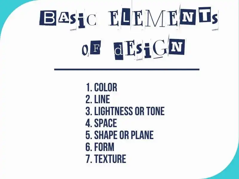
The basic elements of design are color, line, lightness or tone, positive and negative space, shape or plane, form, and texture. These seven elements build absolutely all design materials, whether on screen or printed. There are only seven of them, yet the ways in which they can be used are countless.
1. Color
Every color has its own suggestive power and evokes different emotions in us. If we add to this the amount of color, its placement, its relationship to other colors on the format, and how they are combined and used, sometimes we can literally tell an entire story using color alone.
Color is the element you notice first. Designers use color to describe mood, light, depth, and even point of view. In order to harness colors to work for you, you must know the basic characteristics of each individual color, as well as their relationships and the characteristics of those relationships. For this purpose, in addition to the principles of color theory, the so-called color wheel is used, together forming a set of guidelines for mixing, combining, and manipulating colors. In design, for example when talking about visual identity, these are used to create color schemes for a specific brand.
2. Line
Line is the next basic element of design, and to return briefly to elementary school, it refers to the path between two points. This path can take many forms, straight, curved, rounded, jagged, and depending on the method and medium used to draw it, it also gains thickness, so it can be thin, thick, uneven, solid, dashed, and more.
In addition to its appearance, the position of a line also changes the viewer’s perception. A horizontal line conveys a sense of stability and calm, a vertical line conveys a sense of dynamism and tension, and a diagonal line conveys movement. Lines are often used in design to direct your eye toward a specific point on a poster or flyer, that is, where the designer wants you to stop and look.
3. Lightness or tone
We know that black is the darkest color and has the lowest lightness. White is the lightest and therefore the lightest tone. Between black and white are shades of gray. Every other color also has a certain lightness value, so blue is usually darker than yellow, while yellow and green on the ideal color wheel have equal lightness. I know this sounds abstract, especially since everyone imagines a different shade of yellow, so I will not dwell on it, you just need to remember that every color, in addition to its chromatic value, also has a lightness value. Just as I mentioned white and black and the gray tones in between, you can similarly imagine, for example, a strong yellow that gradually becomes lighter and softer until it reaches white. Each tone of that yellow tells a different story.
What is interesting about the lightness of a tone is that it is relative. For example, in bright sunlight, a blue chair may appear dark to us, but if you happen to come across it in semi-darkness, it may appear lighter than its surroundings.
4. Space
If you know how to control space, in our case the surface of paper or the frame of a screen, you know how to guide the viewer to look at your design in the way that suits you. You can literally direct their attention to move from element to element in the order you have envisioned.
The basic terms we use to explain space in design are white, negative, or empty space, which we mentioned earlier, and positive space, that is, the elements that appear on our format, such as text, images, and graphic elements.
Every element on a surface must have empty space around it, especially text. If you stick elements right next to each other, you create visual chaos and the viewer does not know where to look first, which tires them and ultimately causes them to give up on examining your cluttered website, advertisement, or brochure.
5. Shape or plane
A plane is any shape that has two dimensions, width and length, and is enclosed by some outline. It can be geometric, for example a square, circle, triangle, hexagon. Such a form has angles and is mathematically consistent. A plane can also be irregular, that is, organic. These are shapes that naturally appear around us, for example puddles of water. They are characterized by an element of randomness. They are not as predictable as geometric shapes.
In addition to these, there are also abstract planes, which, for example, represent certain things in nature but are not perfectly consistent and are simplified. For instance, a person as drawn by children. The one level above a “stick figure”, with thick arms and legs. Here is a practical note as well: if you want to convey a sense of order and control in your design, use geometric shapes. If you want to evoke a feeling of spontaneity and naturalness in the viewer, organic shapes are the direction you should take.
6. Form
Form refers to the way a shape or some physical configuration occupies space. Again, to return to elementary school mathematics, specifically geometry, forms are shapes that have three dimensions: length, width, and height. If a plane is defined by the x and y axes, form additionally includes the z axis. Form is everything around us that we can comfortably hold in our hands.
Now, since visual communication designers most often work on a plane, on paper or a screen that does not have that “z” axis, designers must create an illusion. Instead of creating shape through a three dimensional physical form, which paper does not have, designers create the appearance of a 3D form on a flat paper or screen surface by using light, shadow, emphasizing object contours, negative space, and relationships to surrounding objects.
7. Texture
When we say “texture”, we usually think of the physical sensation of touch when we run our fingers over a surface, for example rough, smooth, velvety. Visual texture, this “designer” one, is illustrated using various means on a screen or on paper. We cannot feel it with our hands, but because we have prior life experience, the viewer can sense the “velvety” quality of a drawn texture even though they cannot actually touch it. By thoughtfully adding texture to design material, the designer creates a richer visual and sensory experience.
Knowing these “seven plus seven” basic principles and basic elements of design literally saves you time, nerves, and money, and working on design materials and with designers becomes much easier because you know how to speak the language of design. By understanding these concepts, you can communicate with a designer in an informed and confident way and choose the best solution. Additionally, if you are not satisfied with the proposed solutions, you will have well grounded reasons for why something should be changed or improved. And a designer will not be able to “sell you a story”.


Barbara Zec
Barbara Zec is a visual communications designer with over 20 years of professional experience. She focuses on creating design solutions that are recognizable, functional and resist passing trends. She enjoys the challenges of putting new brands "on their feet" and provides her clients with design support through all phases of brand building and, later, brand maintenance. In addition to working actively with clients, she is involved in education in graphic design and visual communications, and writing about design and related topics.
Categories of trends
- News
- Sale
- Marketing
- SEO
- Web design
- Social media
- Technology
- Regulations
- Management
- Education
- Finances
- User experience
- Graphic design
Newsletter
Sign up for the newsletter and receive the latest trends and tips straight to your inbox