
- 26.08.2025.
- News, Marketing, Graphic design
Why do some brands always look professional and consistent, while others seem improvised? The difference lies in the book of graphic standards. In her new article, Barbara Zec explains what such a book includes, why it saves you time, and how it ensures that your brand remains consistent in every situation.
Imagine the scene: It's August, peak season, you're being pulled in all directions, and suddenly, out of the blue, an offer falls into your lap – a chance to advertise and appear at one of the world’s biggest trade shows, free of charge. You have the opportunity to present independently on 100 square meters, all-inclusive. The organizer provides transport, accommodation, per diem, media coverage, the chance to present in front of insanely wealthy clients, and covers the cost of printing and assembling all graphics and materials you want at your stand. Everything.
The catch is that all the materials for the stand and PR must be sent within three days. Is it doable?
Most would thank them for the opportunity and say they can't participate. Too much work, too little time. When it comes to the design materials, they don't even know where their logo in curves is, let alone anything more.
But then there are the others, the ones who know exactly what steps need to be taken and where to find all the information to deliver their brand materials. These others know exactly where their logos are and in which format, they know the exact color definitions and have examples of the stand and other graphic materials. These others know exactly who can do what and how. These others definitely have – a book of graphic standards. And they don't pass on the offer from the beginning of the text.

What is a book of graphic standards and why is it important
The book of graphic standards, or simply book of standards (brand book, brand guidelines or brand style guide), is a digital and/or printed document that contains and describes all the elements a brand uses in visual communication, i.e., for branding. If we remember that branding is the process through which a business or product is presented and "implanted" in the minds of customers and differentiated from the competition, primarily through a unified message, verbal and visual communication, then the book of standards is the place where all those elements are stored and made available to everyone working on building that brand in any way. A fairly long sentence which I’ll now break down into simpler parts. Let’s start from the end.
The book of standards is important because it:
- helps in building the brand
- contains all necessary information in one place
- unifies verbal messages
- unifies visual brand elements
- ensures consistency in the use of graphic and other elements
- ensures brand recognition through repetition
- strengthens the brand over time through consistent use
A consistent, stable brand secures your business and creates a sense of safety and trust among customers. This means you’re not competing on price with others, but standing out on the market as the best choice. We know from life that we’re willing to pay more if we know we’ll get quality.
Of course, if you’re consistently using your logo and that’s all, that doesn’t mean you’ll instantly have “smooth sailing”, not at all! You still have to do your core work excellently, but when that excellent work and the consistent image you build merge into one, a positive synergy is created (a much greater value than the sum of those parts).
If that weren’t the case, big brands wouldn’t invest enormous funds into their brand materials and marketing campaigns. Why would they, they’re already well-known?! In fact, the bigger they are, the larger their investments in this area of business, and that should already be an indicator that there’s something to it. Also, the bigger the business and the brand, especially when expanding into different markets and, for example, working with local agencies, the more valuable a good book of standards becomes. Valuable might even be too weak a word – in that case, a good book of graphic standards is absolutely essential!
Maybe now you think I’m exaggerating. Maybe you have your logo and you’re managing just fine. However, let’s go back to that unbelievable offer from the beginning. You have to produce a ton of materials in three days, and to make it all on time, you're sending everything to production in multiple different places. You need to send the stand design, flags, backdrops, and counter graphics to the organizer. You have to choose the carpet, lighting, and additional stand equipment. One printer is handling brochures, folders, and flyers. Another supplier is doing embroidery on T-shirts and caps, and printing on bags. A third supplier is preparing swag (promotional gifts for visitors). A fourth supplier is creating digital materials for social media. You or your employees are making a presentation that must have at least ten slides. Various media outlets are requesting PR materials and photos. Just listing everything that needs to be done uses up one of the three days you have to submit everything.
If you have a well-defined, up-to-date book of graphic standards that contains all those elements and defines them in detail – great! You send each supplier the book of standards and the defined design materials needed. If you still have to make all of that up – you’re in trouble. In the best-case scenario, if you somehow manage to pull it off, once you put all the materials together, you’ll end up with a visual “Frankenstein.” In the worst-case scenario, you’ll give up before you even start.
What a book of graphic standards contains
Such hypothetical cases are something the designer you choose to create your logo should anticipate already in the first conversation. For example, the most common question I get from potential clients who are just starting their first business is, “Can you make me a logo for...”. I can, but I always reply that my logo design service is always tied to creating a basic book of standards. Why? To provide them with clear instructions on how to use the logo, with which fonts and which colors. Because all these are elements that build the brand. You won’t see a Coca-Cola label in green or Milka chocolate in yellow packaging, right? Because applied that way, they wouldn’t be instantly recognizable. And we know that today, customer attention is measured in seconds.
It matters how and where you “stick” your logo. Yes, Coca-Cola has a specific script logo. Milka too. However, while the former is always on a specific red background, the latter is always on a specifically defined purple background. In fact, it's more recognizable by color than by the logo itself.
I explain the book of standards as a document in 2 parts. I call them the basic book of standards, which is the mandatory part, unchangeable in content and common to all brands; the second part is additional and I simply call it applications, depending on the needs of a specific brand.
Part 1: Basic book – what you MUST have
To ensure your logo is used consistently and correctly, your basic book of standards must include the following elements:

1. Logo.
And in multiple formats. This means you need to have a defined, so-called primary logo in color, which you most often apply, then a reduced logo in color. You use that logo in case you have fine print under the symbol that would not be visible in application, for example, on a pen. Maybe you have a very long logo. In that case, you should also have an option that fits into a square, e.g., for profile pictures on social media. Then you should definitely have each of those logos in negative and/or white, if it goes on a colored background. It may seem trivial, but you need to define how the logo is converted to negative. Also, you must have a black logo or a one-color logo.
Too many times this has not been the case. Specifically, if you’ve ever sent your logo to be featured on a poster as one of the sponsors, all others were in a uniform shade, only yours “stood out” in color and on a white square because the designer didn’t know what to do with it. (Or it wasn’t in the right format, but that’s a topic for another time.) Additionally, you need to have the maximum reduction defined as well as the minimum clear space around the logo. These are the basics and are usually found at the beginning of the book of graphic standards.

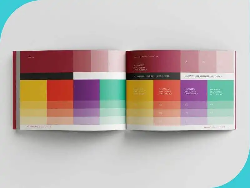
2. Colors.
Every visual identity and brand should have defined colors they use. And not just the logo colors, but also the so-called secondary colors that you’ll use in your digital and printed materials. Next to each color shown, the designer should also deliver, and write in the book of standards, the definitions of those colors.
When I say definitions, I mean at least three variations. New designers today often deliver just one variant, usually for screen display, which can later cause significant issues in print because the color range on paper is different and more limited. The three definitions are as follows:
- the color name in RGB format, defined by three numbers from 0 to 255, used for all types of screens;
- the color name in CMYK format, defined by four numbers from 0 to 100, used for print;
- the color name according to the Pantone scale, which is used for printing from one pre-mixed color.
Depending on the need, definitions like hex for web and RAL colors can also be included.
It’s also good to include proportions of individual colors in the book of standards. For example, T-com has magenta as the main color and it is used for all materials, but there are also defined secondary colors used for emphasis or details.

3. Typography.
Every book of graphic standards, besides the logo and colors, should define the typography you use with your brand. Usually, it’s one or a maximum of two typefaces (one for body text, the other for headings). It is defined by showing a specimen, usually the full alphabet, numbers, and punctuation marks along with the name of the typeface (e.g., Garamond, Helvetica) and styles (regular, italic, bold, etc.)
The three previously mentioned items are the essentials that every brand must have and every book of graphic standards should contain. This ensures consistent use of all your brand elements, which in turn, over time, ensures your instant recognizability wherever you appear.
Before I briefly mention the items that may be found in the second, “optional,” part of your book of graphic standards, i.e., before the applications themselves, you can also include in the basic section a few examples of the types of photographs you want used in your advertising materials, as well as additional graphic elements if you use them. Graphic elements include, for example, icons or various textures. Some major brands go so far as to define the exact setup of reflectors for product photography, the exact type of lighting, and further post-production editing. That way, they ensure a consistent appearance of photos even though they are taken in different locations and by different agencies and contractors.

Part 2: Applications – everything in one place
The second part of the book of standards is optional, but not less important. On the contrary, as your business expands and grows, this part becomes increasingly important because the work gets divided among more people and departments, and later also contractors. Without this part clearly defined, your brand could end up looking like a game of telephone – distorted or unrecognizable.
Often, things stop at the basic book. Due to budget or something else. And that’s okay, you don’t have to know everything right away. And you can’t. However, a good and functional book of standards is a living entity – it evolves and expands. It’s a central hub of information for everyone involved with your brand.
That’s why it’s a good idea, after you’ve created a new material – for example, ads – to include them in the book with all the defined details (placement of elements, margin sizes, headlines, text and notes, logo placement and size, among others).
If we take yacht charter as an example, under applications in the book of standards, you can add:
- Fleet branding: graphic treatment and application of the logo on the hull and sails; application to interior elements, e.g., embroidery on pillows, sandblasted glasses and windows (for various sizes and types with measurements and examples)
- Trade show branding: backdrops, video presentation, counter, carpet color; ads for publications, uniforms and shirts, swag materials (bags, notepads, pens, USBs, umbrellas, raincoats, caps, protective mobile phone pouches...)
- Advertising materials: ad solutions for daily newspapers, weeklies and catalogues in various formats (full page, half page, quarter page, etc.); for so-called image campaigns or targeted promotional offers
- Informative brochures and flyers for sales agents, for placement in tourist agencies and hotels
- Signposts, directional signs, boards, panels and guidelines (from restroom signs to dock signage)
- Type and graphic treatment of buoys, flags and pennants, type and color of rope, type and color of wood and materials, type of finishing...
- Icons, applications, websites and digital banners, social media and visuals for them, final shots and graphic treatment for TV commercials...
- ...everything you can think of.
Over time, as you add new materials to your book of standards, make sure to mark new versions at least on the cover page, for example, with the date of creation or version number and year, e.g., v.1., v.2., and so on.

How to use the book of standards
Your book of graphic standards is a direct investment in the growth of your business and the value of your brand. And over time, as you grow, it will grow too and become increasingly important. But only if you use it every time you need to create a new design material. Don’t let things be done without referencing it because you think it’s faster or more complicated. Trust me – it’s not. In fact, if you work without a foundation or guidelines, you won’t be satisfied with the process or the result.
So, when and how do you use the book of standards? Whenever you need to create any visual material for your brand (I’ve already listed a fair number of examples earlier in the article, so I won’t repeat them).
What you as the owner of the book must do when using it is: know where it is and direct the contractor (printer, designer, and others) to it.
Today, the book of graphic standards is mostly digital, usually in PDF, but some brands also have them on their website. It’s up to you to decide whether you want to give open access to your book of standards to anyone interested or keep control over access. Both approaches have their pros and cons.
If we go back to the concrete situation from the beginning of the text, the book of standards, along with other necessary materials (print-ready files or web visuals), must be delivered to the trade show organizer and the printer that prints and installs the stand’s backdrop and counter; the contractor doing embroidery or printing on shirts and caps your representatives will wear; the contractor printing promotional materials; the PR team and the organizer’s marketing department so they know how to apply your logo on their materials...
Of course, it is assumed that you already have all those elements defined and designed.
In everyday business, if you’re just starting out and working alone, the book helps as a reminder of how and when to apply which logo, and which colors and typography to use when, for example, sending an invoice or a quote. Also, if you’re working with new designers, always send them the book of standards to maintain consistency in the design of new materials. Keep in mind that you must control the image of your brand, and designers sometimes tend to add something of their own or change things because they think it’s better than what you already have. Here, I’m opening up another issue, and of course there are exceptions, but I’ll just say: make sure new designers stick to the book. And as your business grows, and you go from a few people to having internal marketing and sales teams, the book of standards must be a reference available to everyone involved. Because you won’t have time to deal with these things – your employees will need to ensure consistent application of your brand materials.
And final tips
How to store the book of standards and where to keep it? First and foremost – in multiple places. Don’t find yourself in a situation where it’s only on an old computer you no longer use. Always make one or two backups. Creating a book of standards takes a lot of thought and time, especially if it is updated over time, and it’s not easy (or possible!) to reproduce if lost.
If you’ve reached the end of this text and realized that you need a book of standards, and you’ve been working without one for a while, you can still order it later. It doesn’t even have to be from the same designer who created your visual identity or logo. However, it’s important to entrust the job to a designer with experience working with both digital and print contractors.
The book of graphic standards covers the visual part of your brand, but by now you already know that your brand is also the way you communicate with your customers. And to ensure that your customers have a consistently high-quality experience even when you’re not directly talking to them, you can go even further in defining your brand. Because the book we talked about today can define much more than the visual. It can define your tone of voice, your values, and everything else that ensures consistency. And it will definitely save you a hell of a lot of time.
In the end, I usually put my contact information on the last page of the book so I leave the door open for any questions the user of the book may have. In the same spirit, I’m leaving the door open here for any questions I may not have answered in this overview. I do this because I know that consistency in the visual presentation of a brand, and then in everything else, is key to building a brand. The book of graphic standards is the perfect assistant and tool on that journey.

Barbara Zec
Barbara Zec is a visual communications designer with over 20 years of professional experience. She focuses on creating design solutions that are recognizable, functional and resist passing trends. She enjoys the challenges of putting new brands "on their feet" and provides her clients with design support through all phases of brand building and, later, brand maintenance. In addition to working actively with clients, she is involved in education in graphic design and visual communications, and writing about design and related topics.
Categories of trends
- News
- Sale
- Marketing
- SEO
- Web design
- Social media
- Technology
- Regulations
- Management
- Education
- Finances
- User experience
- Graphic design
Newsletter
Sign up for the newsletter and receive the latest trends and tips straight to your inbox