- 25.06.2025.
- News, Marketing, Graphic design
In her new article for čarter.hr, Barbara Zec writes about colors – but not in the way we usually perceive them. Instead of traditional meanings, she reveals how context, contrast, and color combinations change everything. A color by itself means nothing… until we see where it is, what surrounds it, and what it communicates. This is a guide that connects design, emotions, and logic, all through everyday examples.
At first, the idea for this article was to make a standard list of colors and then next to each one, describe its meaning – that is, what emotional and other reactions it typically evokes in the observer. And I will do that, so you have a quick reference all in one place to come back to whenever you need reassurance that you're choosing the right color for your business, brand, or marketing campaign. Or curtains. It also works in private life.
In the second part of the article, I’ll scatter everything that was neatly arranged – to show you that color in itself doesn’t matter (!), but the context in which it appears does.
That can mean which colors surround our color, but also what surface it appears on, where that surface is, and what size or shape it is.
This is where the real fun begins. Because a list of characteristics for each color is really just a kind of chromatic alphabet. Only by arranging those “letters” do we get the full picture. So, let’s start...
Color psychology
In short, color psychology deals with the influence that individual colors have on people and their behavior. Different colors have different meanings, connotations, and effects, but they largely depend on the culture you come from and personal preferences. Still, it has been used for thousands of years, so we can't ignore that there's something to it. What we can say with certainty is that color psychology is closely tied to color theory, which is somewhat more precise.
Color theory is based on observations of how colors mix and also deals with questions of contrast and harmony.
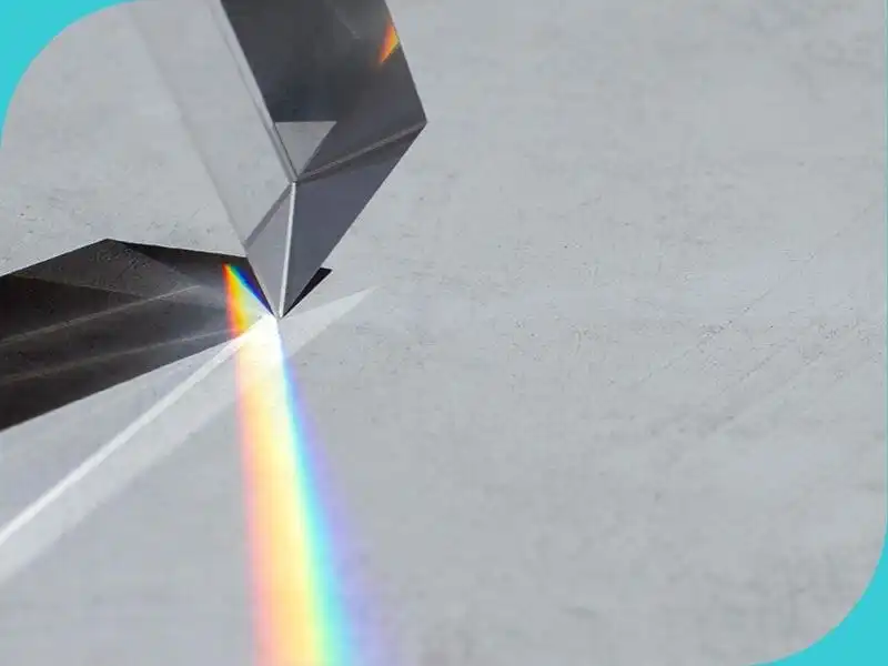
Aristotle, Ptolemy, and later Leonardo da Vinci (among others) explored these questions. But the scientific beginning of color theory is considered to be the year 1666, when Sir Isaac Newton demonstrated the refraction of white light through a prism, which on the other side split the beam into the seven colors of the spectrum visible to the human eye.
We must not forget the poet and writer Goethe, whose most significant work is actually titled Theory of Colors. Color has always been a point of interest from the perspectives of optics, physics, chemistry, and other sciences – not just visual arts. But let’s get back to psychology and, to start, the meaning of individual colors.
Meaning of colors
Below are brief descriptions of the psychological characteristics of individual colors, but take all this "with a grain of salt" because, as we’ll see further on, it’s not that simple.
Red invites action but also suggests danger. It is the most intense color, so it should be used sparingly or its tone softened by lightening or darkening. Concepts associated with this color include: love, strength, passion, confidence, danger. In design and marketing, it creates excitement and prompts customers to take action. On the other hand, it can evoke anger and danger and provoke aggression.
Orange is the color of encouragement, optimism, and confidence. It gives an impression of warmth and happiness because it combines the physical energy of red with the cheerfulness of yellow. It stimulates appetite as well as creativity, adventure, enthusiasm, and balance. It encourages a competitive spirit and action. In design and marketing, it is used to attract attention and as a call to action. Negative side: it can be associated with boldness and frivolity.
Yellow is the color of the sun and symbolizes optimism, happiness, and joy. It is associated with intellect, logic, and enlightenment. It evokes hope and thirst for knowledge, while also encouraging activity and boosting energy levels. In design and marketing, it is used to attract attention and stimulate customer activity. The downside is that it can be linked to envy and jealousy.
Green is the most restful and relaxing color for the human eye. Because it is the color of gentle, fertile nature, it is associated with growth and renewal. It symbolizes harmony, peace, and calm. It increases stability and endurance and also promotes optimism, hope, and balance. It has a therapeutic effect. In design and marketing, it indicates prosperity, transparency, hospitality, and eco production. Negatively, it can be interpreted as greed, illness, and envy.
Blue is one of the most popular colors because it evokes a sense of calm and peace. It is intellectual, reliable, logical, cool, and efficient. It is used to suppress appetite and lowers blood pressure, which also relaxes the body. In design and marketing, it represents stability, cleanliness, and trust, making it the most common business color choice. On the negative side, it can be perceived as cold, unemotional, and unfriendly.
Purple is associated with luxury and power, dignity, independence, and grace. It is perceived as mystical and magical. It stimulates creativity and new ideas, and it calms. It is often linked with royalty, luxury, power, and ambition. In design and marketing, it denotes high-quality or premium products and services. Negative connotations may include decadence, arrogance, and pompousness.
Pink is linked with femininity and gentleness. It is associated with intimate love and calmness. If lighter, it suggests care and nurture, and if stronger, it can suggest shallowness and childishness. It calms and is non-threatening. It is also associated with romance, sweetness, healing, and playfulness. In design and marketing, it is typically used to connect with a female audience. Negative impressions may include vulnerability, superficiality, and weakness.
Brown is associated with resilience and security. It evokes earth, home, and family. It is the color of life’s basic elements. Warmth, comfort, reliability, maturity, and strength are the impressions it leaves. It inspires trust, is grounded, reasonable, and responsible. It gives a sense of comfort and simplicity. In design and marketing, it is excellent for agricultural products and services. Negatively, it can be seen as dull and passive.
Black is contradictory. It is associated with power, calm, sophistication, and mystery. Other terms associated with this color include: protection, comfort, formality, seductiveness. It also marks beginnings and endings, which can be pleasant or not. In design and marketing, it is linked with luxury. It grounds other colors. On the negative side, it can appear reserved, depressive, and pessimistic.
Gray is neutral, impartial, and indecisive. It is calm and emotionless. It gives a sense of coldness and (self)control. It can be formal, but not as striking as black. It is said not to emit any energy. In design and marketing, it is often used because it is unlikely to offend anyone, and it is formal, official, and neutral. However, it can also leave an impression of being characterless, and signal depression or loss.
White is the lightest color. A beginning. It is associated with purity, innocence, and integrity. It represents perfection, symbolizes beginnings and new opportunities. It gives an impression of neutrality, cleanliness, freshness, clarity, simplicity, and hope. In design and marketing, it is often used because it draws attention to what surrounds it. Like other colors, it also has negative connotations and may leave an impression of indecision, coldness, and emptiness.
No color is good or bad. Here I’ve listed positive and negative connotations for easier orientation, but sometimes, for example, you might intentionally want to use that “negative” coldness of gray. Especially if you’re overheating in the middle of summer at +40. Then that coldness works in your favor and becomes desirable.
Color definition parameters
Just as different letters create different words and meanings, combining a color with other colors can change or emphasize some of its characteristics, i.e., leave different impressions on the observer.
I must also mention two other significant characteristics of each individual color: brightness and saturation. Namely, each color has three values. What we usually refer to as “color” (red, yellow, etc.) is actually the hue. The second characteristic is value, i.e., the brightness of a given color. For example, black is dark and has less light value, while white is the brightest and has the highest light value. And the final characteristic is chroma, i.e., how saturated, pure, or intense a color is. For instance, the red of a lighthouse is an intense, strong red; while cherry red is muted, medium.
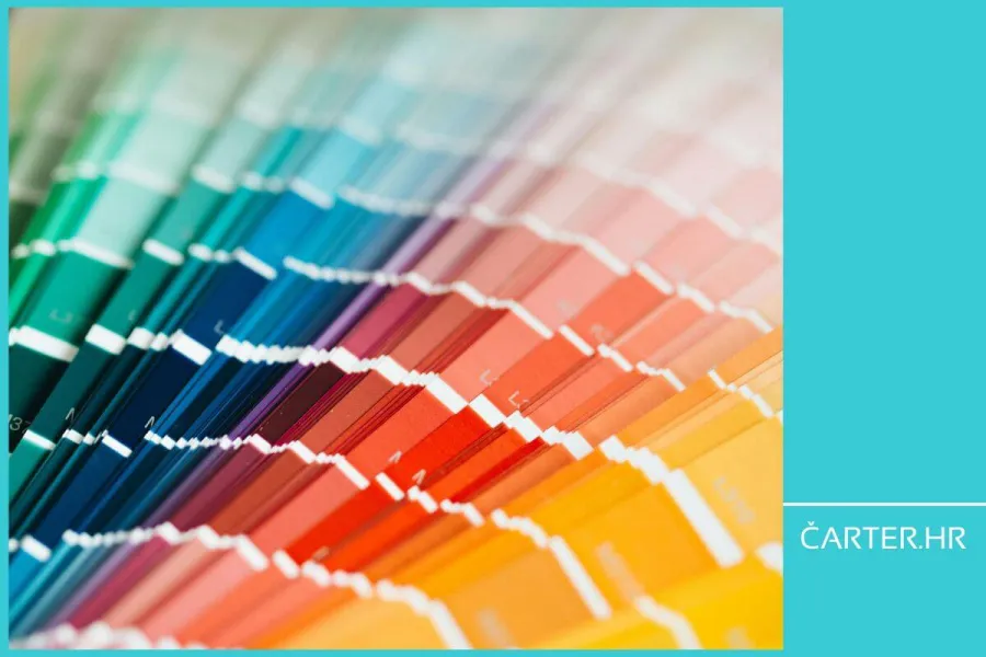
In design, the color names mentioned above are rarely used because there are hundreds of shades of each one. In spoken language, we usually describe a color to try to convey the exact shade, so we say “lemon yellow” or “peach orange” or “baby blue”...
That still isn’t enough for a designer, who instead refers to colors by numbers. Because every color has its exact numerical value depending on the color mode being used. I won’t go into that in depth now, but for now it’s enough to know that every brand (including yours) has a precisely defined color which might be, for example, 129.216.208 in the RGB system – in this case, Tiffany blue.
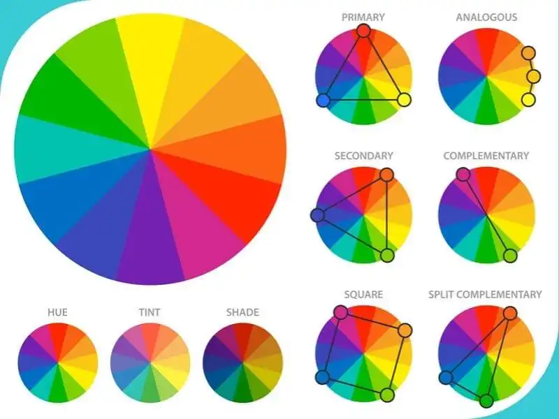
Another useful tool for choosing colors and combinations is the so-called color wheel. It is a visual representation where colors are arranged according to their chromatic relationships.
It features primary colors, between which are secondary colors (obtained by mixing primaries, e.g., orange is made by mixing yellow and red, and is therefore positioned between them), and sometimes tertiary colors. With the help of this wheel, whose halves consist of cool and warm tones, various harmonies or color schemes are created.
Combinations and new meanings
If we recall that blue, as mentioned above, is a cool and calming color, we can combine it with green to add a bit of warmth and comfort. If, on the other hand, we want to emphasize that same blue even more, we might decide to add a bit of orange for contrast. Just a bit, so the orange doesn’t take over the primary role.
Generally, if we want a more harmonious, calmer impression, regardless of whether we’re dealing with stronger, warmer colors or “quieter” cool ones, we combine them with colors that are near them on the color wheel above. If we want more contrast and energy, we’ll opt for colors on the opposite side. Returning to an individual color – if the blue we chose has more black in it, it is darker and more muted, and it will certainly give off a completely different impression than turquoise blue.
This example is probably familiar to you as sailors – you know yourself how much the “blue” and “blue” of the sea can vary depending on where you are offshore or docked, or what kind of day it is and how the sun falls. If we add to that the fact that a color never exists on its own but in combination with two, three, or more colors, the psychological characteristics of colors I mentioned at the beginning start to lose meaning. They should actually be used solely as a starting point for further work and decisions.

Colors and safety at sea
To conclude, I’d like to touch on the colors used at sea. Specifically, why are sailboats usually white? And what’s with the trend of black sailboats and yachts? Of course, other colors exist too, but there’s a reason why a standard has been established, and it goes beyond the psychological meaning of color. I don’t deny that a white sailboat reflects a sense of lightness and cleanliness, and a black yacht a sense of luxury – this matches the color characteristics we mentioned at the beginning – but it’s also a matter of practicality. Sailboats are predominantly white because white is practical and easy to maintain, and more importantly, it reflects light, meaning it keeps the interior and exterior of the boat cooler.
Surely you’ve stepped barefoot onto a scorching dark surface at least once and then jumped onto the white one. Naturally, white is also a traditional color, and last but not least, it’s a matter of safety – that is, how visible it is at sea. Large black yachts, in short, could be described as “because we can,” and they compensate for their visibility with size, but they are certainly not the most economical choice (to put it mildly).
I’ll end with something practical – and perhaps unexpected – but related to the topic: the color of swimsuits. Namely, I’ve come across several illustrations showing how the color of a swimsuit helps with visibility – specifically referring to children, but it applies to everyone. When choosing swimsuits, we usually go by personal preference, but maybe it wouldn’t hurt to also consider visibility. Because blue, although the most popular color, is also the least visible in water. In 2019, the company Alive Solutions, which specializes in water safety, tested which color is the most visible.
The general rule is: the higher the contrast, the more visible the color. In the sea, that would be bright yellow, orange, and red. It also helps that these colors call for action and joy in life. So, keep them in mind and choose wisely.

Barbara Zec
Barbara Zec is a visual communications designer with over 20 years of professional experience. She focuses on creating design solutions that are recognizable, functional and resist passing trends. She enjoys the challenges of putting new brands "on their feet" and provides her clients with design support through all phases of brand building and, later, brand maintenance. In addition to working actively with clients, she is involved in education in graphic design and visual communications, and writing about design and related topics.
Categories of trends
- News
- Sale
- Marketing
- SEO
- Web design
- Social media
- Technology
- Regulations
- Management
- Education
- Finances
- User experience
- Graphic design
Newsletter
Sign up for the newsletter and receive the latest trends and tips straight to your inbox