- 30.06.2026.
- Graphic design
Typography is not just about choosing a beautiful font. It determines whether your text will be readable, clear, and persuasive. In this article, Barbara Zec presents the basic principles of typography, the difference between serif and sans serif fonts, and the most common mistakes that can ruin the overall impression of your visual materials.
One of the indispensable elements of every design and graphic solution is text. It is therefore fascinating to notice how little attention is paid to it when designing materials. Here I exclude the so called "big" brands, that is, those whose graphic standards manuals contain hundreds of pages and that have successfully existed across different markets for a long time. A considerable number of them are fully aware of the importance of good typography, so much so that they have their own typefaces. When I talk about those who do not pay attention to it (and some do not even know what the term actually means), I mean emerging brands, your brands, or local ones that you see as your competition. Today, we are going to change that.
All design materials, in fact, all visual communications, use three basic elements: colour, text, and image. An image may or may not be present. Let's take a fleet of vessels as an example. The standard is to brand them on the hull and/or sails, and the name is always displayed and a colour assigned, while an image is very rare.
I have already written about colour, so if you skipped that article, you can find it here. Text, especially typed text, is so deeply embedded in our world that we see and read it, but we rarely think about how it is designed. Yet it is precisely its design that keeps us reading or drives us away. And no one wants to drive away a reader while they are holding a flyer with the latest offer, right?
What is typography
When we say typography, we mean two different but connected concepts:
- the design of letterforms (typefaces)
- the arrangement of letterforms on a surface (paper or screen) in space and time.
No one whose primary profession is not typography would, in their right mind, engage in the first concept, designing letterforms, because creating a functional typeface that you can actually type with (such as the one you are reading right now) requires an enormous amount of patience, knowledge, and time. The time needed to create a single functional type family can be measured in months of dedicated work, and sometimes even years!
Today, we are dealing with the second concept, the arrangement of letterforms. Because we already have the letters. Someone else created them. We just need to choose them from the drop down menu in the software we use.
I should also mention another name for typography that is used much more frequently, and that is the font. The key difference is that a font originally referred to only one style within a particular type family, for example Arial Regular. When you add Arial Italic and Arial Bold, together they form the typeface. Nevertheless, today both words are commonly used as synonyms.
Why Typography Matters
As I have already mentioned, there is no design without letters, without typography. It sounds abstract, but look around you. We are surrounded by typography. From the "STOP" traffic sign and the printed names of places, exits, and motorway rest areas, to the names and numbers on vessels. From invitations to the opening of a new marina, to the text in contracts with your customers. From the logo on this page, to the very text you are reading right now.
Typography matters because text communicates emotion even before we read it. The same text written in different letterforms takes on a completely different meaning.
Many people, when they start designing on their own, stop at this point. For example, you are designing an invitation for an elegant, formal dinner. You will look for typography, that is, a font, that looks traditional, perhaps with flourishes, the very embodiment of elegance. On the other hand, if you are organising a children's party, you will look for playful, "chunky" fonts, perhaps shaped like animals, balloons, or something else.
And this brings us to the second quality that typography must have: readability. A font or typeface that is not readable is not a good one. It may have the most interesting flourishes and decorative elements, but if the viewer cannot read your elegant yacht name, it is not a good font. If the text is not readable, no one will read it. They will give up after the first sentence. Because it tires the eyes and the brain. (Later, I will give you a few tips on how to make your text easy to read.)
I should also point out that choosing the right typography is important for building trust. Especially when it comes to things such as various documents, contracts, and offers.
Basic Classification: Serif and Sans Serif Typography
In the next article, I plan to focus on the "psychology" of typography, that is, to introduce the different types of fonts that exist and explain what they are best used for. Today, I will focus on the basic classification into serif and sans serif fonts. As the name suggests, they differ in the serif. A serif is a small decorative stroke, or thickened line, on a letterform with an open shape.
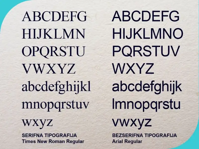
Serif typefaces are older, and serifs originally had a practical purpose. For example, letters carved into stone had serifs so they would remain legible even when the grooves filled with dirt, mud, or dust over time. They also helped reduce wear on the edges. Later, and still today, serif typefaces are used to make reading easier, for example in books, because serif letters have a small "foot" that helps our eyes stay on the same line by creating an imaginary guideline. You are more likely to lose your place if the letters do not have serifs. An example of a serif typeface is the previously mentioned Times New Roman.
Sans serif fonts are newer and much more common on screens. They are more modern and free of unnecessary details, minimalist in style. The first sans serif fonts appeared at the beginning of the 20th century. In print, they were mostly used for headlines, but they became widespread with the rise of screens. Examples include Arial and Helvetica. We still use both serif and sans serif typefaces today, depending on the medium and the purpose.
Most Common Mistakes and How to Avoid Them
Above, I briefly touched on the problems caused by poorly chosen typography, and now I would like to move on to common mistakes and give you some advice on how to avoid them so you can be confident that your texts will be clear and read from beginning to end. The common denominator of all these problems is a lack of readability. But let's take them one by one.
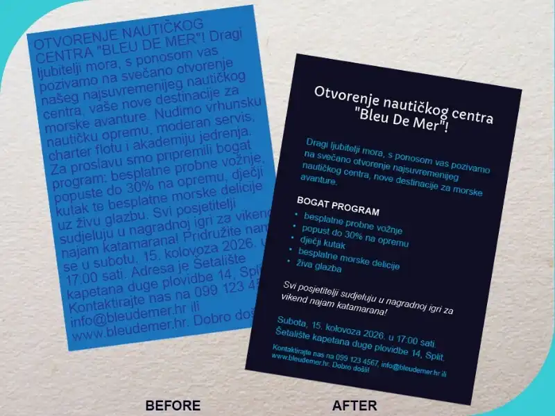
All the text on the page looks like one big, unreadable "block".
Because you want to say everything. This is a problem that your designer regularly encounters. You ask them to design a flyer, and then you give them text that fills two pages in Word. The logic already falls apart here because you cannot fit two pages of A4 text onto a format half that size and still expect to include images and other elements. You know you cannot fit two litres of water into a one litre bottle. You are also creating a problem for the reader, because no one has the patience or desire to decipher tiny text crammed onto a single format.
The solution lies in hierarchy. Every text, every message, has different levels of importance. You need to establish a hierarchy of what you want to communicate, "cut down" the amount of text, and focus on the essentials. On the other hand, the designer will not simply paste in the text you provide but will separate it into the main blocks: headline, body text, and contact information. All these text elements will then be arranged according to their importance, with the most important one, the headline, being the largest, the so called body text being medium sized and easy to read, while the contact information can be the smallest because the reader will only look for it if they like the headline and what you are offering.
The text runs "from edge to edge" across the page.
This continues from the first mistake because the urge is the same, to fit everything onto the page. In addition, why would you "pay for empty space" when there is still room on the paper?
Because empty space in design is just as important as filled space. Imagine standing on the waterfront with a single sailboat in front of you. You cannot miss it. Now imagine standing on the same waterfront with around twenty sailboats of similar size bobbing in front of you. How long would it take you to find the right one? The same principle applies to text on a page. If you do not give it room to "breathe", that is, empty space around it, it will not be readable. In general, the larger the margins or the empty space on a page, the more luxurious and expensive the design appears. Keep that in mind. Especially if you offer luxury experiences, accommodation, or vessels.
What applies to the text on the entire page also applies to individual sections of the text. Separate the headline from the main body, divide longer texts into smaller paragraphs or blocks, and separate the contact information at the bottom from the rest.
And now I will go one step further and suggest that what applies to the whole page, and to individual sections of text, also applies to individual letters. So, if you are feeling ambitious, you can also increase the line spacing. This also improves readability. Similarly, if you increase the spacing between individual letters, reading becomes slower.
You use too many different fonts.
People have a tendency not to remove what is already there but instead to "improve" it by adding more. Yet it is always better to remove unnecessary elements than to add them. Especially in design. Fewer elements mean fewer problems. In this case, let's go back to the flyer I mentioned earlier. You have a lot of text and you do not want it to look boring. So you put the headline in one font, highlight one word in the headline with another font, make some words bigger, others smaller, change the font throughout different parts of the text, in short, you start "designing". The more you add and emphasise, the less readable the text becomes.
The general rule is never to use more than two fonts. Three, if you know what you are doing. That means choosing one font for the headline and another for the body text. If you read newspapers, you will notice that the headlines are often sans serif and bold, while the article itself is set in a regular serif typeface. If necessary, you can also highlight a name or a date using the bold or italic version, but do so sparingly.
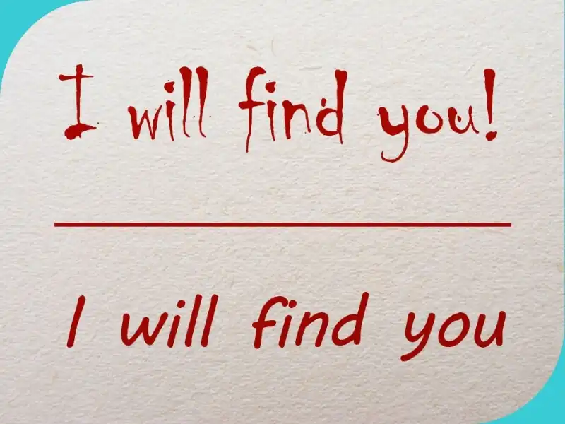
YOU ARE SHOUTING AT PEOPLE
You write everything in capital letters because you think they are clearer and easier to read. They are not. Besides being harder to read in longer texts, they also create the impression that you are "shouting" at people. You can use them for short headlines and emphasis, but again, in moderation. Text written in lowercase letters is much easier to read.
You place red text on a green background.
It does not necessarily have to be this particular colour combination, but some colour combinations have very low contrast and should therefore be avoided. Although yellow text on an orange background may look very "summery" to you, and blue text on a green background may create that perfect "sea vibe". Colours that are close to one another look pleasant, but if we remember that the primary purpose of text is to be readable, we have to make a compromise. We need to start with sufficient contrast. Without enough contrast, your text becomes difficult to read, and if your contact phone number cannot be read, then the purpose of printing five thousand flyers is completely lost. Along with the money you spent on the design and printing. Pay attention to contrast.
Everything has to be in the centre (of attention).
A common problem in promotional materials is small blocks of centered text. Because they look elegant and "designed". Unfortunately, such texts are difficult to read because we do not know where the next line begins. This is especially true for longer texts with ten or more words per line. The general rule is that longer texts should always be left aligned, just like this article. This makes them more uniform and creates a solid, straight edge that both the text and the reader can rely on.
***
I hope I have managed to bring you closer to the importance of typography and its role in designing your materials. It is important to remember that the primary purpose of text in any design is to be functional and readable, and to communicate the message and information the reader needs. You can read more about the character of letterforms and typefaces in the next article.

Barbara Zec
Barbara Zec is a visual communications designer with over 20 years of professional experience. She focuses on creating design solutions that are recognizable, functional and resist passing trends. She enjoys the challenges of putting new brands "on their feet" and provides her clients with design support through all phases of brand building and, later, brand maintenance. In addition to working actively with clients, she is involved in education in graphic design and visual communications, and writing about design and related topics.
Categories of trends
- News
- Sale
- Marketing
- SEO
- Web design
- Social media
- Technology
- Regulations
- Management
- Education
- Finances
- User experience
- Graphic design
Newsletter
Sign up for the newsletter and receive the latest trends and tips straight to your inbox