- 25.08.2026.
- Graphic design
Brand typography is not just about what a font looks like, but also about the message you communicate through it. In the article, Barbara Zec explains how to choose a font for your brand, what to consider when it comes to licences and different markets, and what impression serif, sans-serif, script and decorative fonts create.
Anyone who has ever used any computer program to write something has opened the program and selected a font from the drop-down menu. Now, there are those who, realistically, do not care and simply type in whatever font appears first. The second group already has preferences, so they usually choose between a serif or sans-serif font. And the third group, which I hope you will also join after reading this article, knows that every font brings a certain style and tone. In other words, they know that the way something is said (or written) is just as important as what is being said (or written). That is why today I am bringing you a quick overview of font types, their characteristics and what choosing each of them says about your brand.
Note: Before I go any further, I need to clarify that I use the term “font” even though the correct term would be “typography” because it is clearer in everyday conversation and more familiar to you, given that computer programs and folders use the term “font”. I wrote about the difference in the first article on typography.
How to choose a font (typography) for your brand
Typography for your brand is chosen during the process of creating your visual identity. Along with your logo, colours and imagery, this is the moment when you decide what kind of lettering you will use from now on across all your design materials. Everything. Whether it is signage on a sailing yacht, a contract, a billboard, a website or a TV commercial. In other words, you are deciding what style you will use to communicate with your audience.
Why is this important? Because of consistency. Consistency in use over time and across materials strengthens your position and the image of your brand in the minds of your customers. Consistent use makes your brand recognisable. And what is recognisable and familiar feels safe. And what feels safe is the first choice.
So, how do you choose which font to commit to? First, you need to pay attention to a few technical things. Let’s get those out of the way and then move on to the more enjoyable part. I’ll be brief.
1. You can have two brand typefaces. In fact, it is even advisable.
Because, let’s be realistic, we want style, but we also want simplicity and readability. It is like choosing clothes. It is good to have a few classic pieces that work with everything and always look good, and then add more eccentric details that draw attention. It is the same with fonts. You need one as a base, the simpler one you will use for all longer texts. And you need one that makes you stand out. For the so-called body text font, I recommend tried and tested classics such as Open Sans, Helvetica or Times New Roman. Because they are commonly used across all platforms, which means they will be displayed the same way everywhere. For example, your website will have the same font on both a Mac and a PC.
2. Always check the licence, because “free” can end up costing you a lot.
Creating a high-quality typeface takes a great deal of time and knowledge. And that is why it can come with a hefty price tag. So, if you are just starting out, there are high-quality free fonts offered by, for example, Google or Adobe. It is important to note that when you “download” a font, you should also download the licence document, the so-called EULA (End-User License Agreement), and save it. Because it can happen that over time a free font becomes popular and suddenly starts being sold. It can also happen that it is free for print but not, for example, for use on a website. So always pay attention to the fine print and the types of use you are permitted. For some applications, you may have to pay extra.
3. Choose a font that includes č, ć, š, ž; i.e. one that works across different markets.
You will often see a design material with a beautiful image and a large, eye-catching headline promising luxury and a premium experience, and then, right in the middle of it, a small thin “č” that definitely does not belong there. It is not from the same font. When choosing a font for the Croatian market, check whether it includes diacritical characters. If it does not, every time you type a letter that requires a “diacritic” the system font will be inserted and it will look like a mistake. An alternative for shorter headlines and texts is for your designer to draw in the diacritic where needed. However, you need to be careful here because the designer needs to know what they are doing. Also, what will you do if you enter a market that requires new characters? You can avoid this problem from the start by choosing fonts that contain characters covering multiple markets.
Once you know what to look for when choosing typography for your brand, it is time to choose a style. And, as promised, below I am bringing you a short overview.
Types of typography and the emotions they evoke in readers
Every shape in nature triggers a biologically and/or culturally conditioned response in us. For example, if I showed you two shapes, a soft, rounded cloud drawn with a line and a shape drawn with sharp, hard lines that look as though they were scribbled quickly, which of the two would give you an impression of aggression? I am sure you chose the second one. The same applies to all design elements, from colors to fonts. We use all these elements to evoke a certain emotion in the viewer, and later an action. In the case of your client, that would mean recognising your brand as the most desirable choice, followed by an action in the form of interest and purchase.
Below are the basic types of typography and their characteristics. Another factor that plays an important role in the overall impression is what are known as “weights”. Roughly speaking, these refer to the thickness of the letters. For example, one typeface (of any kind) can have several weights, such as Bold (thicker letter strokes), Regular (standard letter strokes) or Light (thinner letter strokes). So, depending on the weight, the same typeface can give an impression of strength and solidity (Bold) or softness and lightness (Light). There are many factors at play here, even though we are talking “just about simple letters”, but you have to start somewhere. So, let’s go in order.
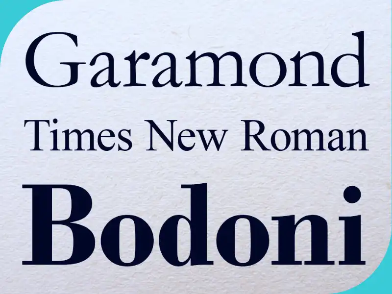
1. Serif fonts
These fonts appear sophisticated, are associated with tradition and inspire respect. That is why they are common among official institutions, as well as in academic and formal contexts. If you have a traditional company that has existed for generations, it is very likely that it has used serif typography from the beginning (because there were no other options at the time). If you want to convey an impression of traditional values and elegance, it can be a good choice. They are also common in books and newspapers because they make reading easier. They are not common in yacht charter, but you will often see them used by lawyers, older universities and in the financial sector.
How can you recognise them? Letters with open strokes at the ends have an additional small horizontal stroke, called a serif. It looks like a little “foot” on which the letter stands firmly.
Caution! If you decide to use these fonts, you need to think carefully about how you will incorporate them into your brand. If you do not get the balance right, they could make you look “older” and give the impression that you are not keeping up with the times.
Examples of serif fonts: Bodoni, Didot, Garamond, Noto Serif, Times New Roman.
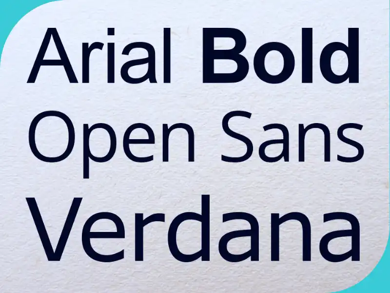
2. Sans-serif fonts
As the name itself suggests, these are fonts without serifs. They consist of basic letter strokes and have no decorative additions that serve no function. This treatment gives them a modern appearance and evokes simplicity and cleanliness. Functionally, they offer excellent readability on screens. Especially at smaller font sizes. They are therefore ideal for more modern brands, technology brands and new brands. In fact, they have been the most prominent type of font across all areas of business for years. They are ideal for at least one, and perhaps both, of the typefaces used by a brand in the yacht charter industry.
How can you recognise them? The letters consist of basic lines – circles, vertical, horizontal and diagonal lines depending on the character. They have no additional decorative elements.
Caution! These fonts are extremely practical and are therefore widely used. A problem can arise when designing brand materials because many of them “look the same” since most brands use similar typography. You can avoid this by combining them with other types of fonts or by using them in a way that differs from what is common in your industry.
Examples of sans-serif fonts: Arial, Helvetica, Open Sans, Futura, Verdana.
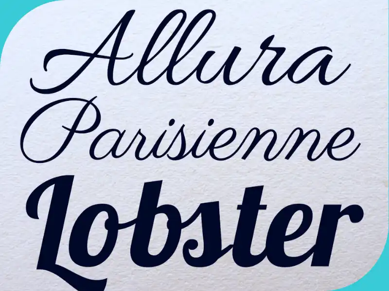
3. Script fonts
These fonts imitate handwriting. In typography, the term is used collectively for typefaces (fonts) that imitate fluid writing on paper, namely connected “handwritten” letters and formal calligraphy.
Depending on whether they are formal or casual, they can give an elegant, romantic or playful impression. With casual fonts, these are often personal handwriting styles, each with its own character. If your goal is to express the personality of your brand and make it feel approachable, you can use them for various accents (this type of lettering is already used on many yacht charter websites).
How can you recognise them? They look like handwriting or calligraphy even though they are produced by typing. The letters flow and are connected.
Caution! Because they are less readable, they should be used very sparingly. Ideally for a single word or phrase, and even then you need to check whether the letters are easy to read, i.e. whether they are clear to the people around you.
Examples of script fonts: Allura, Lobster, Lucida Script, Parisienne, Script MT.
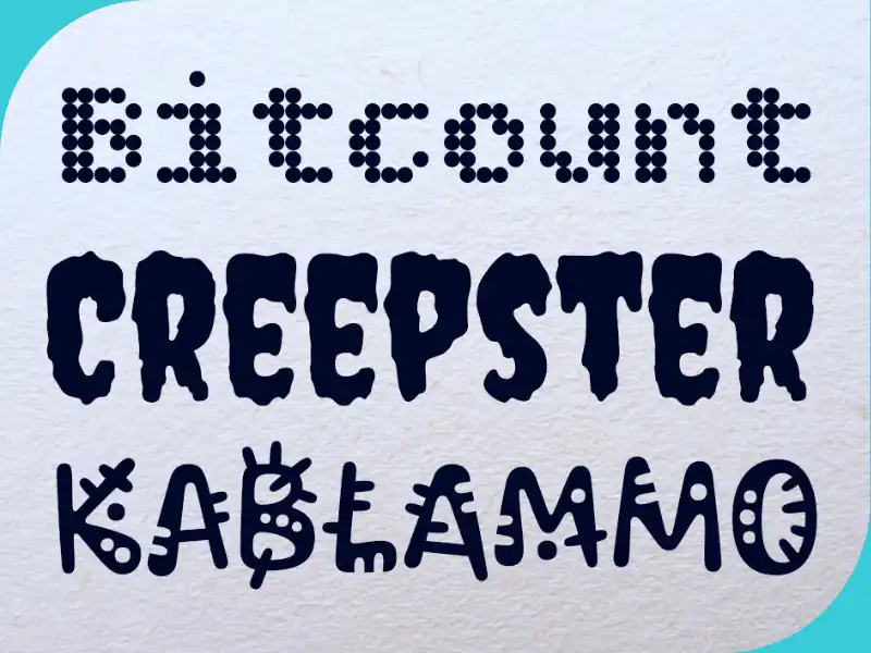
4. Decorative fonts
Decorative fonts are all those that are “cool”, unusual and have highly distinctive styles that you do not quite know where to place. They are often designed with a very specific idea in mind, for example, to evoke horror, the joy of the New Year holidays, or a particular period in time, either in the future or the past. These fonts are fun and immediately attract attention, especially if they feature a theme that is close to you, such as the sea and sailing, and that is exactly why you should avoid them.
How can you recognise them? The characters have unusual shapes and proportions, or are more or less decorated with various additional elements and even illustrations.
Caution! A decorative font brings its own story and visual language with it. So, unless it was made specifically for you and commissioned for your brand, it will “eat your brand for breakfast” and impose itself over all the other elements of your brand.
Examples of decorative fonts: Bitcount, Creepster, Kablammo, Plaster, Rye.
Final notes
Typography is a very broad topic and it is difficult to cover everything important in two articles, but I believe that this information alone will help you the next time you have the opportunity to choose a font for your materials, if you do not already have it defined in your book of graphic standards.
In the previous article, I explained the basic terms and, even more importantly, the most common mistakes in use and how to avoid them. Today, you gained an overview of the basic types and their characteristics. I should note that all types also have their own subtypes and can be divided according to different criteria.
Besides choosing an individual typeface, you should also keep in mind that two different typefaces are often used (as I mentioned at the beginning), and this is what we call font pairing. Most often, this means one font for body text and one font for headings. There are, in fact, rules about which fonts work well together and which do not. For example, fonts that are similar are not a good pair. They are also not a good pair if they both have strong but completely different characters. So, which ones are good, if neither too similar nor too different works? That depends on several factors, and the ideal pair is one that has a good balance between harmony and contrast, and one in which the fonts complement each other. A good font pairing guides the viewer’s eye, makes the reading process pleasant, and does not look like visual chaos and two different stories, each pulling in its own direction.
If you are currently looking for a new typeface for your brand and everything you have read so far has only raised even more questions, feel free to contact me and message me on LinkedIn, I will be happy to reply and help you resolve your questions.

Barbara Zec
Barbara Zec is a visual communications designer with over 20 years of professional experience. She focuses on creating design solutions that are recognizable, functional and resist passing trends. She enjoys the challenges of putting new brands "on their feet" and provides her clients with design support through all phases of brand building and, later, brand maintenance. In addition to working actively with clients, she is involved in education in graphic design and visual communications, and writing about design and related topics.
Categories of trends
- News
- Sale
- Marketing
- SEO
- Web design
- Social media
- Technology
- Regulations
- Management
- Education
- Finances
- User experience
- Graphic design
Newsletter
Sign up for the newsletter and receive the latest trends and tips straight to your inbox